Writing
Designing a Cover; Antonio Hill
“There are books of which the backs and covers are by far the best parts.”
…said Mr Brownlow to Oliver Twist in Charles Dickens’s children’s classic. You will find no such books here, but what you will find is designers who have the skill and talent to create an outside to a book that reflects the magic that is going on inside.
Every element on a well-designed book cover has been placed there with care for a reason. We were intrigued to find out the inspiration behind the covers for Antonio Hill’s crime novels.
We asked Senior Designer Richard Shailer from Transworld how he went about creating such a dramatic cover.
Over to Richard:
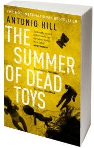
‘The Good Suicides followed the style of Antonio’s previous book, The Summer of Dead Toys, so I used another tight crop of a heavily treated photo for the image while the text was distressed to make it look more crimey. The type was set in Din, a really legible font which is handy if you’re going to distress it down, as I did.
The wavy pattern texture in the text was taken from the patterned pavements of the Ramblas streets in Barcelona, where the story is set and I wanted to refer to the location somehow on the cover without resorting to showing a landmark or doing anything too travel brochure-esque. The resulting cover is quite stark and obviously crime fiction, but hopefully different enough to stand out amongst the ‘alleyway scene’ covers that tend to populate this market.’
A big thank you to Richard for talking us through the design of Antonio Hill’s novels and the intricacies of creating a font.

Read the book:


Please note: Moderation is enabled and may delay your comment being posted. There is no need to resubmit your comment. By posting a comment you are agreeing to the website Terms of Use.